Creating a visual design system
Project management / Art direction / Visual design system / UX design / Front-end development
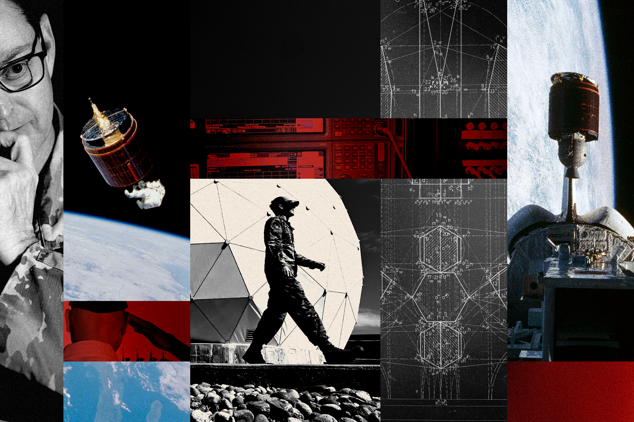
Illustration by Anna Lefkowitz
In summer 2025, I was assigned to be the designer and front-end developer for a multi-part series by reporter Christian Davenport exploring the militarization of space. The project would include three stories, some which would utilize photos and videos as the primary visual storytelling method, and others that would require complex interactive graphics to explain complicated systems and processes in space.
Despite this being a complex, multi-part series, there was no projects editor or visuals editor assigned to this effort. I stepped in to fill these roles and acted as the project manager and art director for the series, in addition to my other design and development duties. I spent several months leading this project, which included running weekly meetings, coordinating reporting, graphics and photo teams, maintaining production schedules and deadlines, and working with newsroom stakeholders to schedule publishing times and promotion assets.
Project brief and management
At the start of the project, I worked closely with graphics reporters to establish a visual identity and system that could work across the entire series. The effort focused on two big themes: outer space and the military. To meld these two visual aspects, we wanted to create a system that felt tactical and strategic, while still nodding to the elegance and mystery of space.
Visual research
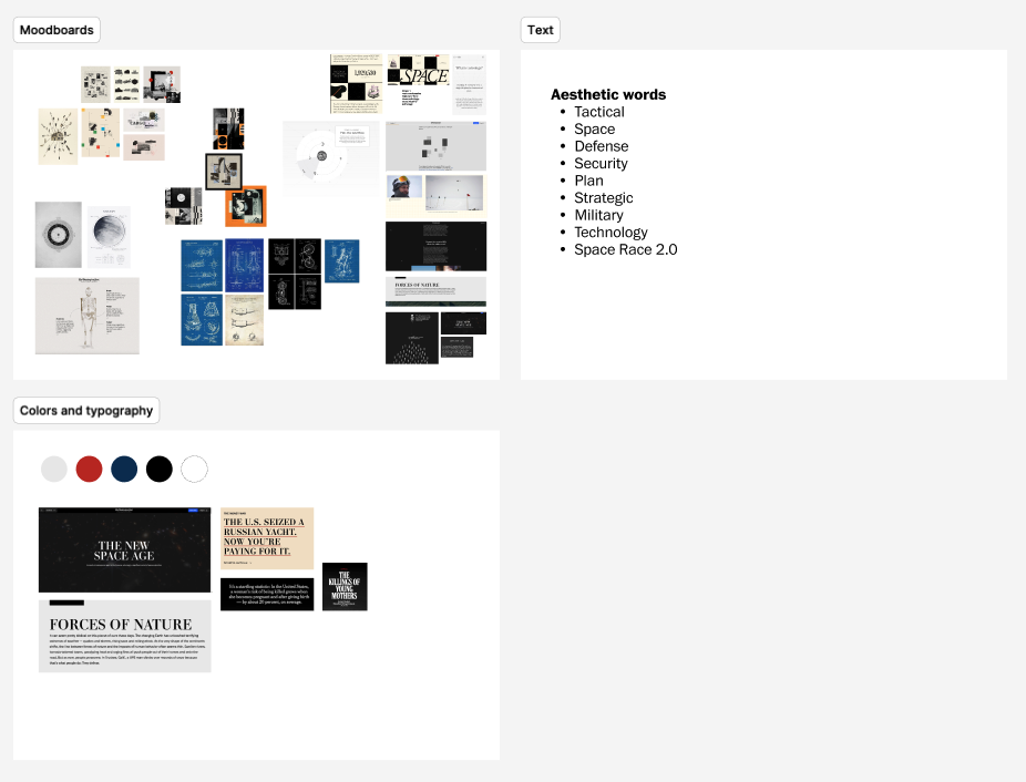
My final moodboards on illustration styles, typography and colors, as well as guiding words
Since the stories would each utilize different methods of visual storytelling, we needed a system that would work with photos, videos and graphics while still maintaining a clear identity and visual cohesion. Additionally, we were working on a condensed timeline to produce complicated graphics and animations. We also wanted to prioritize building a system that worked in both light mode and dark mode.
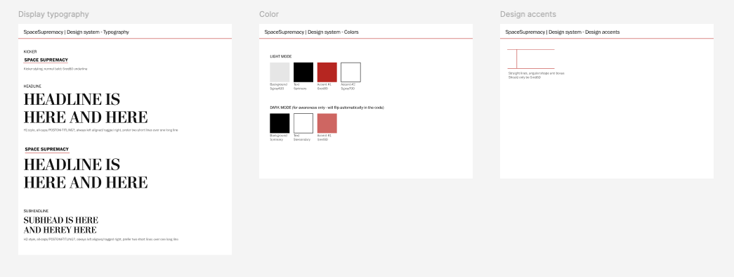
We landed on a restrained color palette of black, white, gray and red that would work in both light and dark mode while meeting accessibility standards. We also used a bold but elegant typographic and subhead style, and components we could replicate across the stories.
Design system
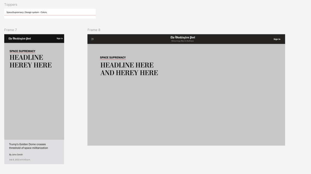
Art direction and topper experience
I wanted to design a topper experienced that could be utilized across all of the stories in the series, whether they used photos or graphics. I commissioned an in-house Post illustrator to create a series of photo collages to be used across the story, using photos and graphics from the stories as well as additional archival images. I collaborated with the illustrator and photo editor to identify images to use in each composite and provided feedback and guidance using the stories as a framework. After the illustrator created the illustrations, we adapted them for mobile and print.
In addition to having the illustrations, I wanted to design an interactive topper experience that would nod to space by creating a “launching” effect. Once the assets were created, I hardcoded the layers into the story and applied a parallaxing effect, which allowed parts of the illustrations to flow at slightly different rates.
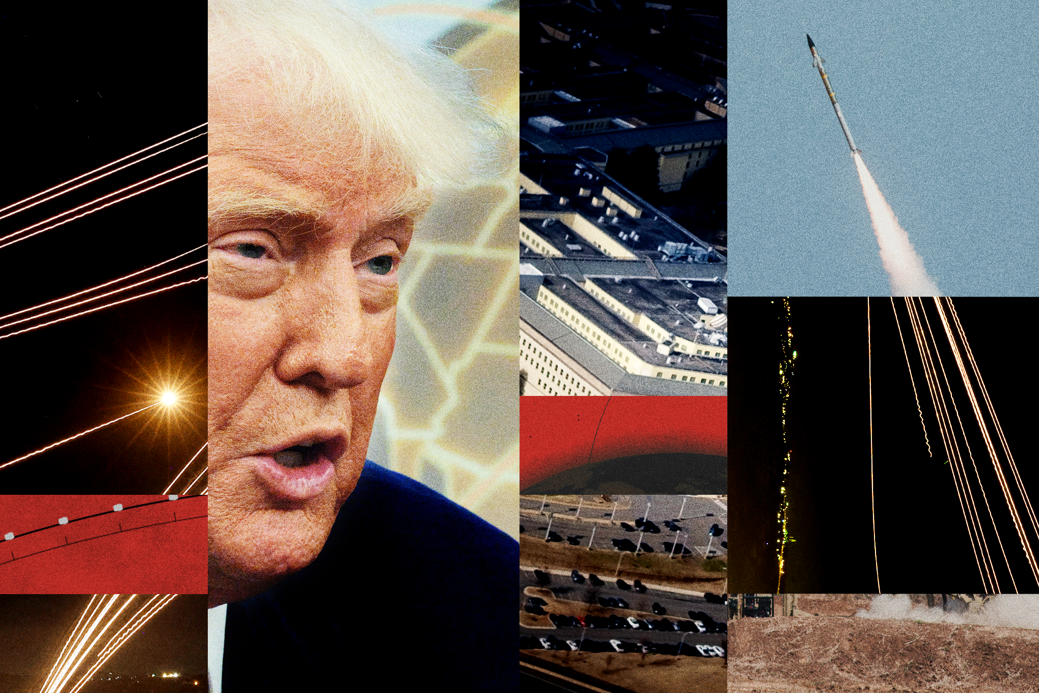
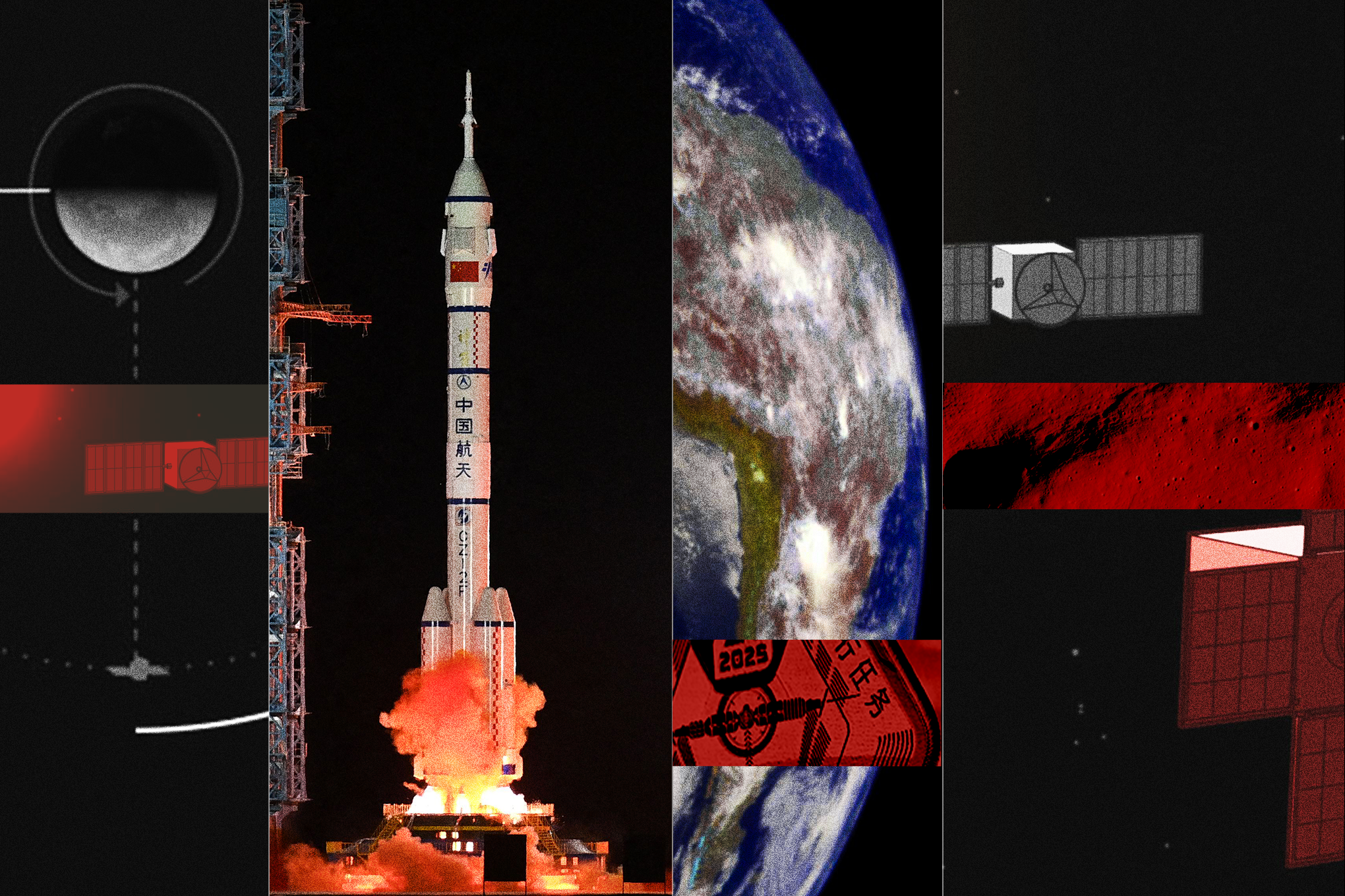
Illustrations by Anna Lefkowitz
After the graphics were created, I worked with the graphics reporters and text editors to integrate them into the story. As the project manager and art director, I helped identify the appropriate spots in the stories for the graphics and ensured that the text properly transitioned in and out of the graphics section, in some cases helping to identify spots to splice the graphics to make sure they were seamlessly distributed throughout the story.
I also worked closely with the graphics team to make sure the graphics were created so that they would blend seamlessly in with the rest of the design. I also designed and coded the text boxes that would scroll over the graphics, adding in increased opacity at the top of the scroll on mobile to make sure the important parts of the graphic weren’t covered.
Graphics
Graphics by William Neff and Aaron Steckelberg